Hi, I’m Christian and this is a newsletter with interesting content and links orbiting the world of graph.
This is the third edition of the newsletter and I’m really interested to hear if it’s at all interesting. Drop me a line to let me know what’s good and what’s… less good.
This edition was sent out to subscribers on the 27th of January. Sign up at the bottom to get source/target delivered to your inbox every other Thursday!
Graphs
When you look up at the night sky what do you see? If you’re graph-inclined (as I’m sure my readers are!) you probably spot constellations straight away. Indeed, an early historical example of a network graph is that of the night’s sky. As ever there’s a practical application for visualizing these graphs: the positions of the stars in this network is important for, say, navigation or the forensic analysis of photographs.
To an observer looking upwards it makes sense that these stars appear to be in a fixed point in the sky. The same can be said when we work with graphs with a geospatial element—typically latitude/longitude coordinates. There’s a snapshot or range of fixed locations for the vertices that makes sense to the viewer. There’s limited benefit to running a layout algorithm to highlight clusters of interest as you lose the geospatial context that makes the view so useful.
There are lots of competing terms available when we talk about graphs. This is especially true for the confluence of graphs and geospatial data. I’ve spoken to many intelligence & insurance fraud analysts who refer to graphs as “maps”. For individuals in the orchestration and network management space; “network maps” is synonymous with “graph”. Sometimes it seems the only universally-acceptable term is “hairball”.
I hadn’t heard of “origin-destination” as a term to describe geospatial graphs until last year but it’s an apt way to describe something I previously referred to as “graphs on maps”. Just like “source & target”, “origin & destination” explains the role of the nodes we’re considering.
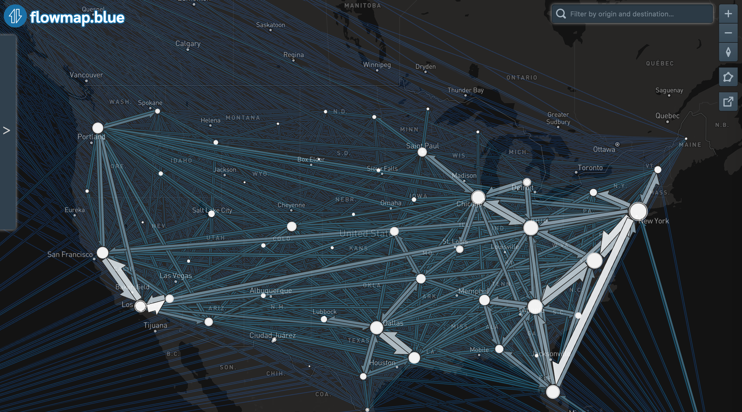
One stellar example of this sort of visualization is flowmap.blue – a project I admire for bringing together a number of technologies into a slick and cohesive package:
- Data for flowmap.blue is supplied by Google Sheets which makes it extremely accessible for users to create their own origin-destination maps with ease.
- Mapbox is quickly becoming the de-facto standard for geospatial visualizations, and for good reason (for one example see source/target favourite Andrei Kashcha’s project here). The comprehensive API and overall quality of Mapbox’s components is admirable.
- Above all, the user experience is very smooth. So what if the fans in my MacBook spin up and the case heats up enough to scald my legs? When I use flowmap.blue I feel like I’m already in the future of web-based visualization tools.
Take a look at my top three favorite Flowmaps to see what I mean:
- A mesmerizing view of bird migration on a single night in Europe.
- A fascinating view of refugee flow around the world in 2017.
- Near and dear to my heart as an ex-Torontonian, this map shows the regional travel flows in the “Golden Horseshoe”.
Let me know if you have any favorites. If you don’t have newsletter fatigue already you can sign up to the flowmap.blue release newsletter on the homepage.
Nodes
Just in time for this week’s look at origin-destination graphs here’s a recent survey and attempt at building a taxonomy of geospatial graphs from Sarah Schöttler. I could probably write a whole thing about some of these.
To bring us back down to Earth here’s a mildly-frustrating article from TED that clearly prioritizes busy and distracting visualizations over insightful ones.
Janos Szendi-Varga has updated their Graph Technology Landscape repository for 2020, with guest coverage on the GraphAware blog.
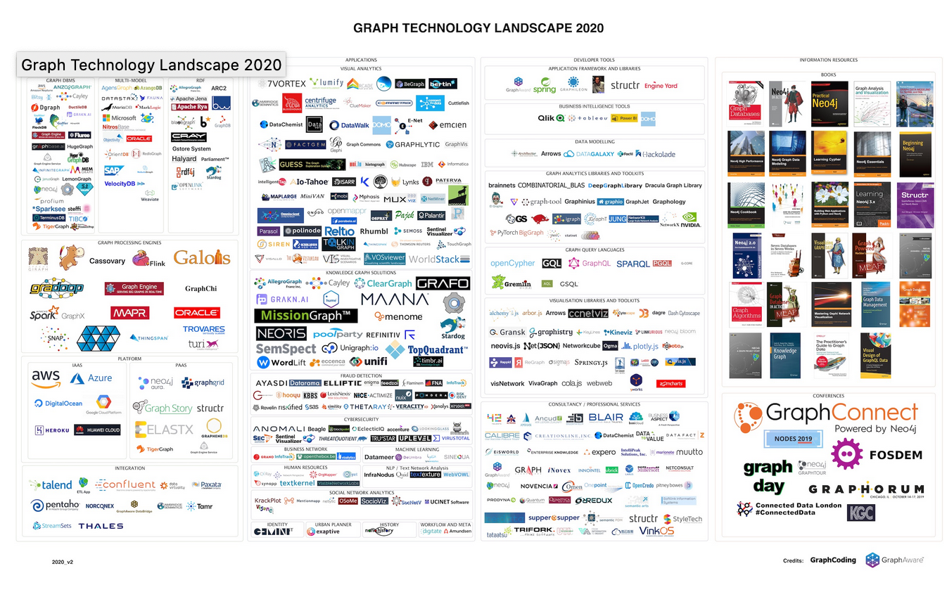
It’s not an easy job to label and classify hundreds of companies, projects & books but Janos has a pretty good go of it.
Hat tip to Micah Stubbs for highlighting a “no-code knowledge graph” webapp from ThinkNum. Take a look at this blogpost for a neat approach for analyzing Facebook platform data with the tool.
Links
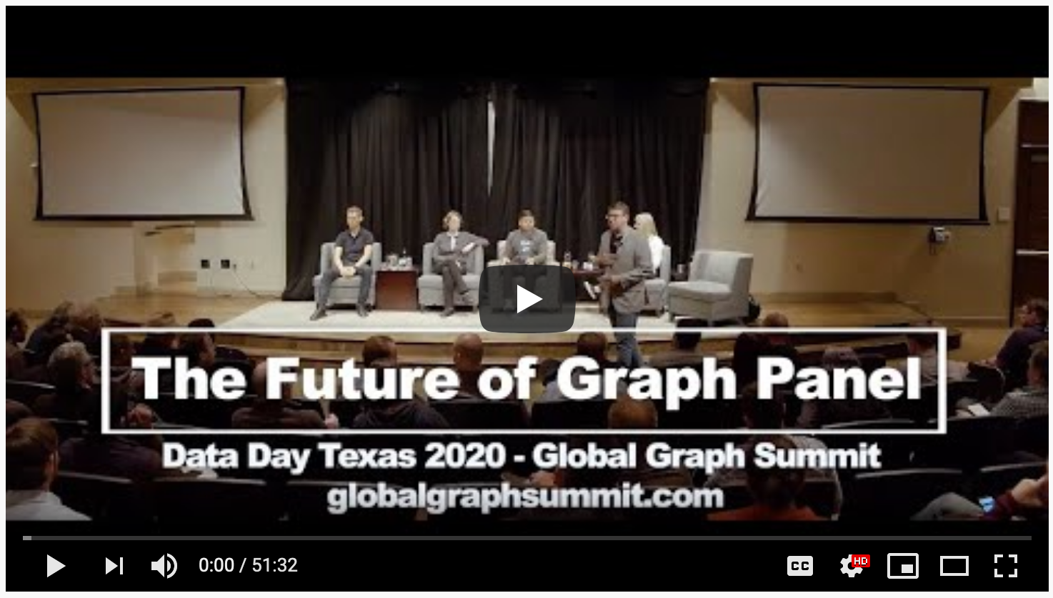
The Future of Graph Panel from the Global Graph Summit has been posted to YouTube and it’s a breezy coverage of the processes and challenges facing graph practitioners in 2020 and beyond.
I took a stab at visualizing some Pokemon data a little while ago but there’s a fresh blogpost from Joe Depeau (Neo4j) exploring it in a lot more detail. I’ve been spending some time with the Cypher query language recently and (as showcased here) it’s really second-to-none for graph-focused querying.
I stumbled upon this blogpost from Snow Plow Analytics in 2018 and it’s a thorough look at the pitfalls and benefits of different event-data modelling for graphs. Definitely worth a bookmark for the next time you’re umm-ing and ahh-ing over the right model for your event data.
I enjoyed this article from Venkatesh Rao. It highlights Roam Research (see source/target #1!), newsletters (like this!) static websites (like mine!) and Twitter threads (!) as an emerging space of a sort of lower-fi-internet. The article gets pretty rambly by the end but there’s nothing wrong with that, right?
That’s it for now. Let me know if you have any thoughts or suggestions. Otherwise I’ll see you again in two weeks.