Hi, I’m Christian and this is a newsletter with interesting content and links orbiting the world of graph.
source/target will share content that uses “graph-thinking” to find real insight into the world around us.
Thanks for signing up! I’d love to know what you think. Please feel free to reply to this email with comments, suggestions & criticism. Don’t worry, I can take it.
Graphs
Roam Research
There’s lots of buzz online around the note-taking web application “Roam Research”. Billed as a tool for “networked thought” Roam makes it easy to auto-magically build up a network of interconnected notes on different topics. Through “bi-directional links” users can hop back and forth between notes that reference the same idea or concept. This is particularly interesting for note-takers: references to other pages are automatically promoted to pages that may already reference concepts mentioned in previous notes. Cool!

You can hear from the many fans on Twitter and there’s an impressive collection of logos on the homepage showcasing users from reputable organisations around the world.
I believe the appeal of Roam in 2020 is a result of the slick web application experience trading on the interest around “graph-adjacent” tools.
Of course, this type of modelling notes as a graph isn’t particularly innovative. You don’t have to dig too far into Roam recommendation threads to find someone speaking fondly on their “second brain” systems leveraging org-mode or, aptly-named, The Brain.
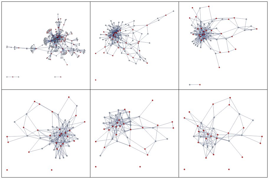
Even less of a game-changer is the notes graph network view baked into the tool. Built with CytoscapeJS this gives a rudimentary view of all of the links between your pages. nodes/notes are sized by the amount of content found in each page. Hidden away in a context menu is the ability to swap between Dagre & Cose layout algorithms.
Your mileage may vary depending on how anal you may be about tagging and linking different concepts in your notes but more often than not you’re going to get a tangled mess of connections.
I’d like to see an improvement in this area of the tool. It’s not easy to create a truly useful visualization as part of a wider application—it’s easy to get distracted with pretty pictures that catch the eye but ultimately disappoint when it comes to extracting Real Insights™.
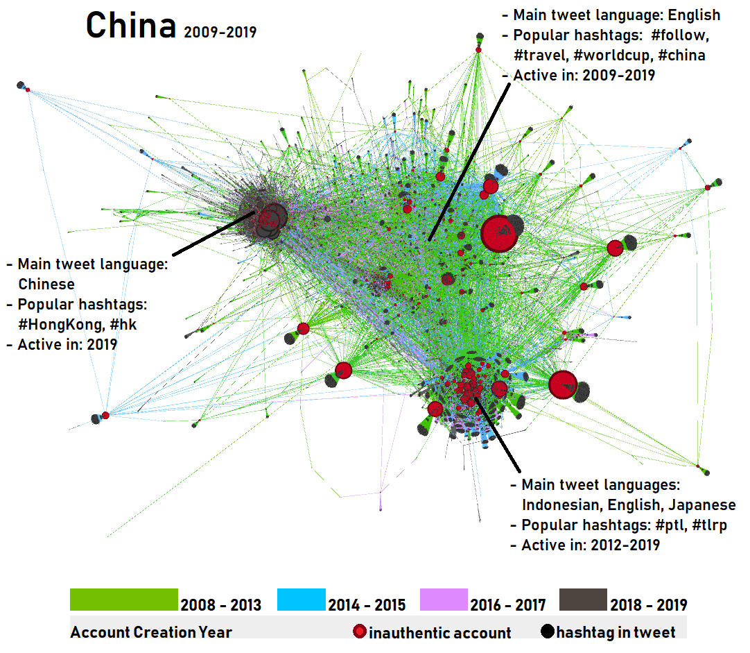
Some power users on the Roam Slack have forged this path themselves. Exporting their notes out of Roam they’re leaning on tools such as Mathematica to get a wholly more interesting visualization of their notes and research. These approaches showcase just how powerful this model and subsequent visualizations can be with a little extra effort.
 Visualization by @vkryukov
Disinformation
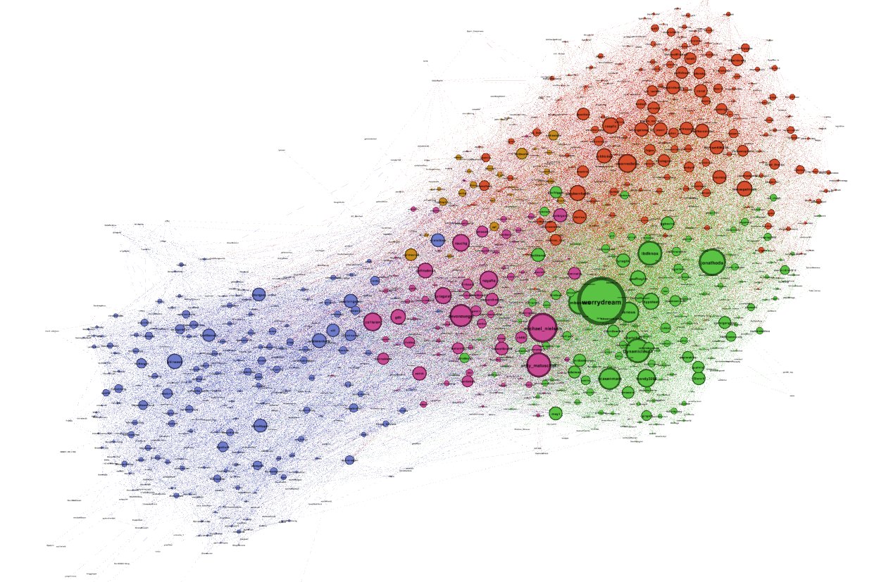
I’m still digesting this impressive work on Disinformation spread across Twitter by Alexa Pavliuc, funded by the Mozilla Foundation.
Colouring nodes by the date ranges is a neat trick and the accompanying videos are electric and feel very tactile. Expect more on this next time.
Twitter Followers
Still on Twitter but for a different purpose. @MenanderSoter wonders aloud in this excellent thread on analyzing followers and cliques on Twitter as a graph rather than as lists of followers. I love his exploration of his Twitter network where he actually maps what he sees in the charts with the real people he interacts with online.
Slipping from the content to the medium for a second I feel the tweet thread tells us a little about around storytelling with graph data. A lot of practitioners using graph analytics and visualizations assume that a slick transition to tell a story is important (I’m looking at you scrollytelling) but sometimes well-annotated static screenshots with accompanying text gives the content more room to breathe.
Nodes
It probably wouldn’t be a graph newsletter without a mention of graph databases. Perhaps content tags would be helpful for those who care less about databases (or visualization for that matter). What do you think?
This month’s DB-Engines rankings show that ArangoDB has overtaken OrientDB according to whatever arbitrary rating they use over there. I suspect OrientDB will continue to fall out of favour, there’s a certain dilution of their brand following the acquisition by CallidusCloud and then the in-turn acquisition by SAP. It’s only a minor drop right now but we’ll continue to see other technologies/vendors eat
OrientDB’sCallidusCloud’sSAP’s lunch.I didn’t make it to the Global Graph Summit in Austin this year but there are a few talks I wish I’d seen. Marko A. Rodriguez’ talk on what he’s describing as a “database virtual machine” seems like a fever dream featuring trends in economic structures, Amazon and Open Source Software. Plus it has this wild slide:
- This conference recap from Denise Gosnell (DataStax) is worth a read (it’s short!). I’m looking forward to the release of her book later this year, it looks like the code has been released online already. I’ll be looking out for the recording of her talk at the Summit as it looks particularly interesting.
Links
Max Demarzi (Neo4j) is staying true to form in 2020 and writing great articles about Neo4j and related technologies. His frank breakdown of database performance benchmarks and the horrors of unchecked query languages is as informative and drily humorous as ever.
Leo Meyerovich (Graphistry) posted an interesting take on the graph database landscape drawing from his extensive experience working with customers on large-scale graph problems. I like his (what I’ll call a) quadrant of OLAP/OLTP/BI/App Dev classifications.
Here’s a neat approach to avoid complicated, pesky graph layout algorithms; simply arrange nodes into a a grid and overlay the links accordingly. Here the nodes are in alphabetical order which of course doesn’t do anything to minimize edge crossings. Nevertheless I’m surprised how nicely this works—especially when selecting nodes of interest.
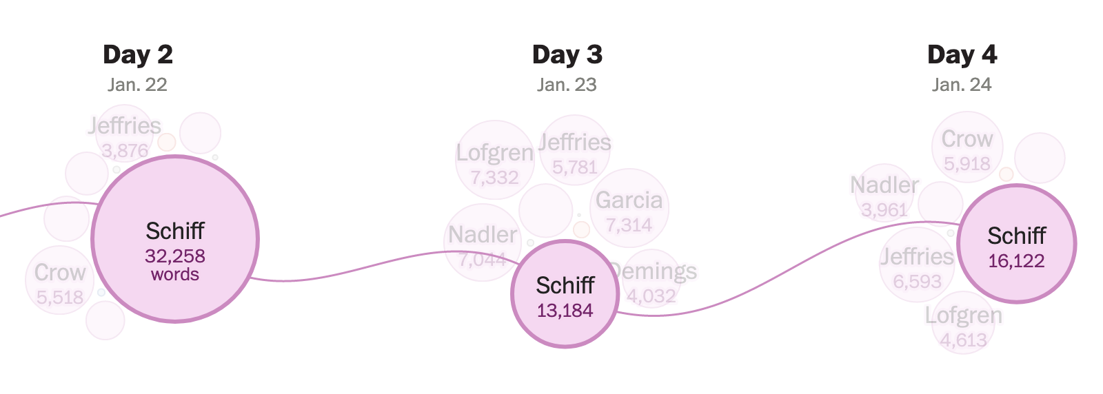
Speaking of hybrid chart types with selection highlighting there’s an interesting bubble chart in this Washington Post article (halfway down the page). It shows the amount of words uttered by House managers and lawyers 6 days into the impeachment trial. Links are revealed on hover so it rewards users. When the data volume is small I love fluid force-simulation visualizations as I feel their instability reflect the people and actions behind the data.
Here’s a great Tumblr blog of examples of network visualization library Cytoscape being cited in research papers. I love a lot about this. It’s fascinating to see deeply-technical datasets typically from biology and related domains visualized in wildly different network charts. It’s a rich library of (sometimes questionable!) color choices, styling designs and data models.
That’s it for now. Please tell your friends (the nice ones) and don’t hesitate to hit that unsubscribe button if this just isn’t quite the sort of content you were expecting.