In this edition I build a view to connect my callbacks, explore the love lives of penguins and tour a sharp hierarchy of cheeses around the world.
Hi, I’m Christian and this is my bi-weekly (fortnightly?) newsletter with interesting content and links orbiting the world of graph. I’d love to hear your feedback and suggestions—hit the reply button to let me know what you think.
Graphs
Years ago I collected, and apparently committed to memory, words that define words. I don’t mean your garden-variety grammatical “verbs” or “adjectives”. Instead I was drawn to the polysyllabic language one could use to describe things we write and say every day.
I know, weird flex but okay.
Take paronomasia; it’s an uncommon word but you’ve almost certainly heard the other name for it. It’s a long way of saying “pun”—my false etymology is that it’s a contraction but “pun” and “paronomasia” are just two words that mean the same thing. “Pun” probably evolved from “punctilio” which sounds more like something you’d take out on the lake, espresso in hand.
Incidentally, Wikipedia reliably informs me that “graphomania” is an example of a pun in Japan—it’s not clear what this means but it’s also a pretty good never-ran name for this newsletter.
Synecdoche was another word. It means taking a small part of a thing to refer to it’s greater whole, for example referring to credit cards as “plastic”. Before the movie (and, let’s be honest, even now) I read the word as “Sigh-Neck-Dosh”— a result of reading these definitions but never using them in speech.
I know a bundle of these words and they surface in my mind more often than I’d imagine. They often come in contrasting pairs: initialisms/acronyms, anaphoric/cataphoric and hyponyms/hypernyms.
To make an anaphoric reference is to link or callback to a previously used concept. Cataphoric is the other way round: a reference to something that happens later. In most media these callbacks bring real depth to the material. A joke from a standup comedian made 45 minutes into her set, calling back to the beginning, lands that much harder. I liken this to lightning bolts of references in the heads of the audience; the synapses are firing.
I listened to a short podcast interview with Justin Duke last week, the creator of Buttondown, the service I use to send out source/target. I’m half a year into my newsletter journey and the podcast emphasized to me the importance and value of writing on a regular schedule. It’s satisfying to see the number of previous editions build up and the habit of curating, writing, editing (hi Katharine!) and re-drafting editions is helping me grow as a writer.
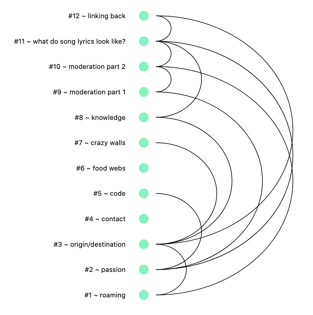
Writing content on the same topic every newsletter, I naturally find myself referring back to previous editions. The value of this is two-fold: new subscribers probably haven’t read the archives, but if I’m writing about something of interest to them they may find previous discussions worth exploring; secondly, I think it helps fire those lightning bolts for those who’ve subscribed all along. Turns out, week by week, I’m building the foundations of a reference graph.
If I extract each of these self-references I get a view that looks like this:

I chose to use an arc diagram to retain the chronological ordering of the editions from top to bottom.
Extracting links and other tags from the “World Wide Web” of linked pages is a decades-old practice—here’s a graphy example from just this week. As I take stock of the first six months of writing source/target I feel particularly reflective. As write more it will be neat to see my self-reference graph slowly extend down the page with each and every edition.
Links
- Culinary historian & author Michael W. Twitty reflects on the formative planning stage of writing
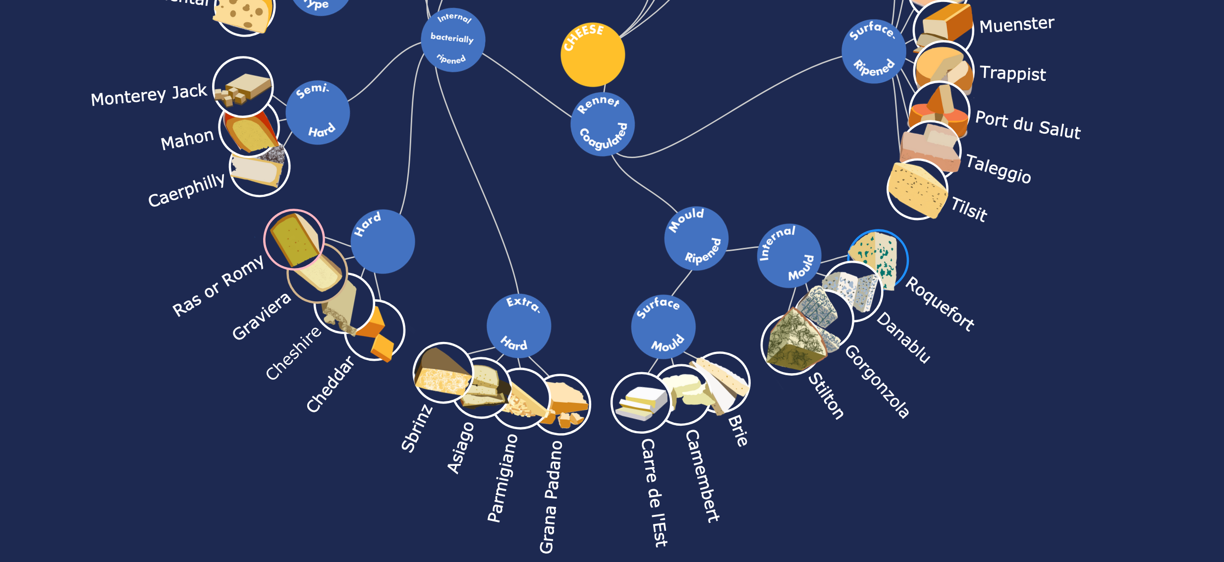
- Cheese lovers would probably say this hierarchy chart from Luz K. Molina is “grate” (sorry)
- Spoiler alert for this family tree graph of the characters in hit TV show “Dark” from Samir Madhavan
Nodes
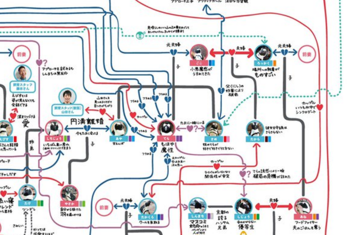
Hat tip to my esteemed colleague Phil Rodgers for sharing this flowchart diagram of relationships between penguins (and humans) at Kyoto Aquarium. It’s a truly fascinating depiction of the apparently intricate love lives of penguins.
There’s a high resolution version of the chart available and an unofficial English translation.
Posted a few days ago, a previous version of the chart went viral last year and spawned this CNN article, probably one of the most mainstream articles to ever describe graph analysis.
I binge-watched a 49-episode season of Terrace House last year and would gladly commit to the same length or more for the penguin version.
Lots of readers were taken with my lyrics graph visualizer from last time. One particularly inspired observation was describing the commonly-found “circular loop” graph as a “clover”. I think there’s potential for more with this app and I definitely want to add more features in the future.
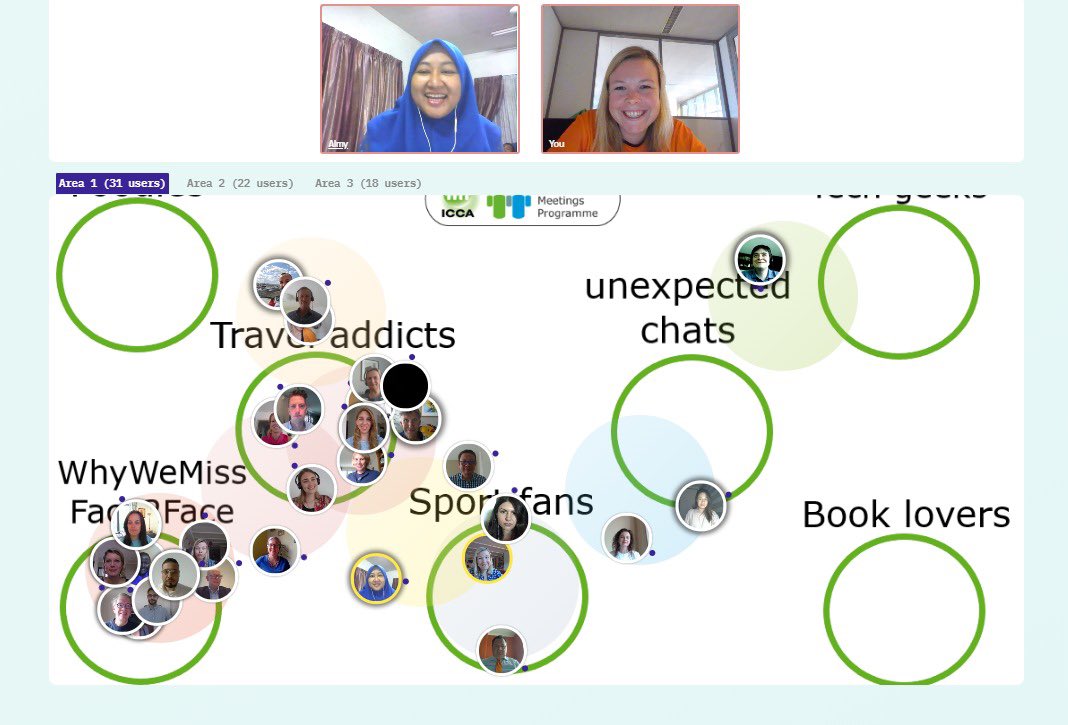
I’m loving the accelerated innovation and efforts being made to turn virtual conferences into more playful, organic spaces for discovery and networking. Yotribe is one example of this: a visual chatroom where attendees can wander between spaces and strike up conversations. It’s reminiscent of Habbo Hotel but suitable for a work environment.
“Habbo Hotel? Oh, it’s like an isomorphic, pixelated hotel, but virtual and over slow dial-up internet… Hello are you still there?”
I’m not sure about the name; Google autocorrect keeps changing it to “YouTube” which is probably an instant fail when choosing a name for a company.
This isn’t just an attempt to refer back to as many old editions as possible but this interactive visualization of European migration flows is an alternative depiction of a similar dataset I shared back in March. There’s a full write-up of the methodology from authors Francisco Rowe & Nikos Patias along with accompanying code.
Thanks again for subscribing, I hope you enjoyed this edition. Please continue to send suggestions and thoughts to this email, I love hearing from you.
Stay safe, see you in two weeks.