Hi, I’m Christian and this is a newsletter with interesting content and links orbiting the world of graph.
It’s satisfying to see this little newsletter reach edition #4. The cadence of every other week feels right as well, not too regular but right on cue when you’ve almost forgotten about it. What do you think?
I’m very grateful to buttondown.email for an excellent, no-nonsense service for newsletter sign-ups and mailings. I’ve moved my archive over to my new personal site to keep everything in one place. You can now check out the archive here.
If you like source/target please do forward it to a friend!
Every once in a while there’s a world event or craze that leads to a massive spike in interest on a particular topic. Yet very few, if any, seem to have captured the same general interest as the novel Coronavirus, or COVID-2019. Take a look at this—admittedly unscientific—Google Trends view of the popularity of the search term vs. the most popular other topics I could find:
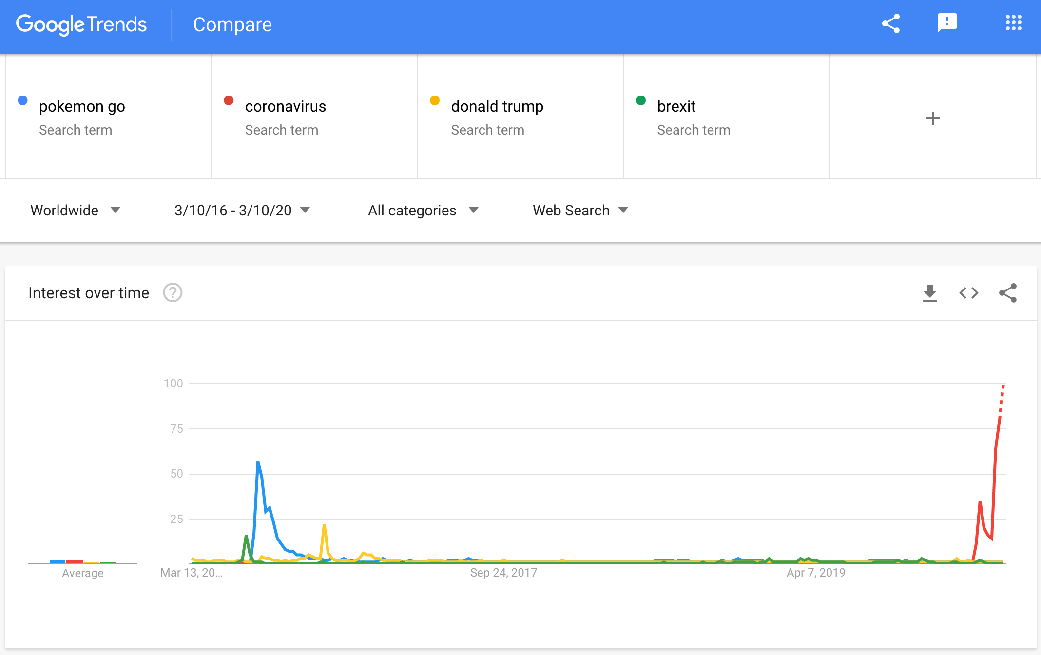
This isn’t surprising. COVID-2019 is, of course, a global event with severe repercussions for personal connections, public safety and industry.
To be honest the content being produced on this topic is pretty overwhelming. It’s felt like a bit of an arms race for companies and organizations to release flashy websites and graphics to convince you that they are the authoritative source on this sort of analysis.
On that note, I really appreciated Amanda Makulec’s pointers and related article calling for practitioners to pause, think and carefully consider what they are communicating before producing content around the virus.
So that’s why today I’m not going to cover the anxiety-inducing minute-by-minute updates on COVID-2019. Instead I’ll look to the recent past at the network science that informs our understanding of the spread of diseases.
Graphs
I picked up a copy of Linked last week. Written by the renowned and influential Albert-László Barabási, it’s a breezy primer for those interested in the networks that support the world around us. It’s also a good introductory text as it avoids diving into the gory mathematical details. Of particular interest to me was chapter 10: fads & viruses. In it Barabási uses a variety of compelling real-world examples to explore how infections and trends percolate through a network of contacts.
 |
Linked was published nearly 20 years ago and there are some dated references; the world of 2020 is a different one to 2002.
For a start, there are a number of awkward references to formative technology concepts of interest. Take “crackers”, a term used to describe hackers with a penchant for breaking computer systems in a malicious way—as a contrast to “hackers” who mess around with computers for personal satisfaction.
There’s also a mention of groundbreaking and polarizing research into “parasitic networks”—the attempt to get a remote computer to execute some function without being detected. To the technologically-minded reader in 2020 this would be your bog-standard “botnet.” I wonder what terms we’ll find quaint in 20 years time?
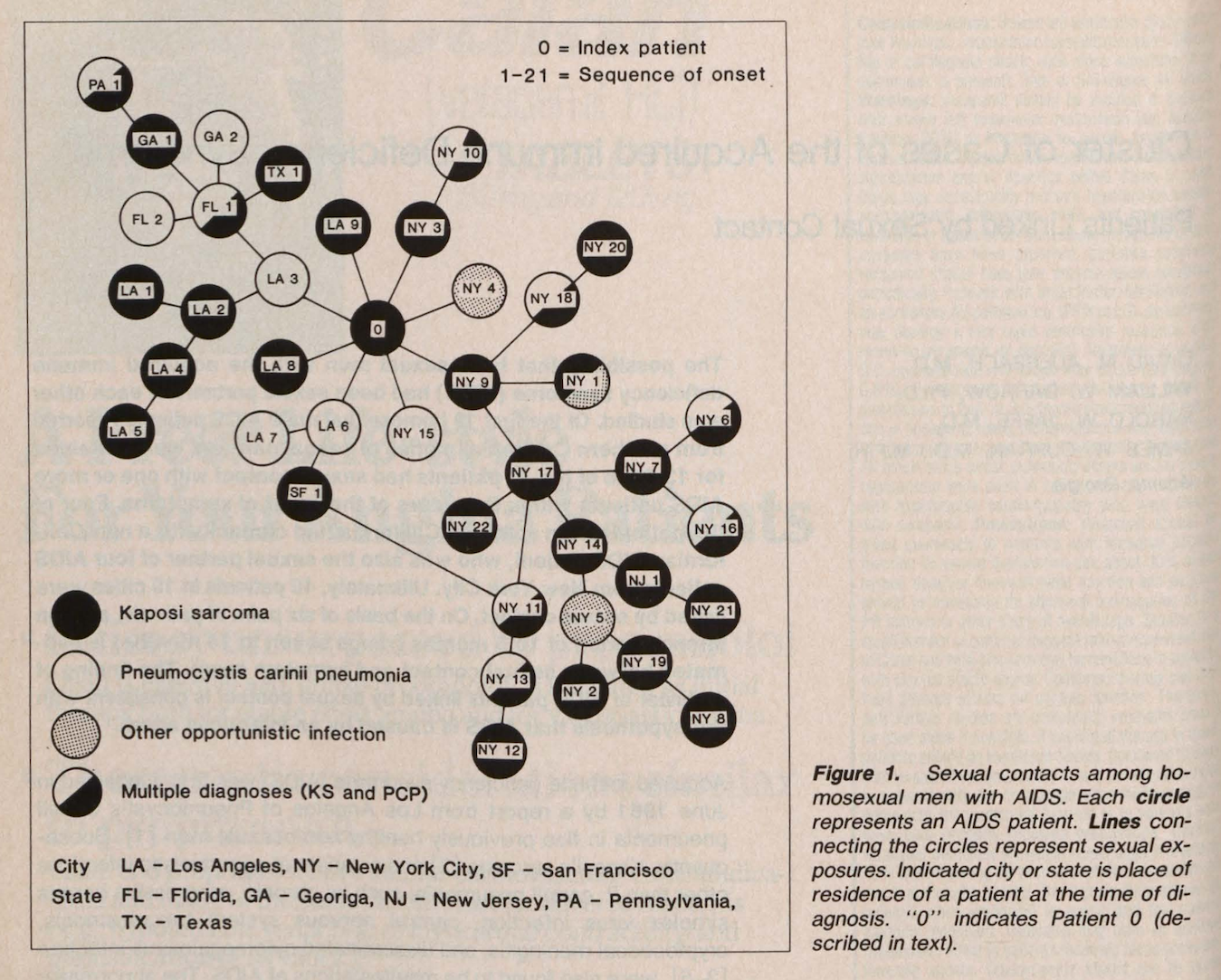
I should also point out that the depiction of Gaëtan Dugas at the beginning of the chapter recounts the homophobic narrative pushed by a since-discredited book from 1984. Dugas was a Canadian widely-regarded as the primary case (or “Patient Zero”) for the AIDS epidemic in the United States. Barabási notes that “it is not clear whether Dugas brought AIDS to North America” and, indeed, this theory was thoroughly debunked in 2016.
To gain an understanding of and prevent the spread of diseases, experts analyze the complex networks of connections between individuals in a population. In medicine this analysis is known as epidemiology and typically focuses on tracing the connections that make up your “contact network”.
A contact network includes but isn’t limited to your social network. Your friends and family make up your social network while your contact network also includes anyone you interact with in your day-to-day life. It could include colleagues at work, strangers on your bus commute home or an acquaintance you shook hands with at a meet-up or a wedding.
As described in this excellent summary from Maclean’s, it is now understood that Dugas may have been the victim of a potential misunderstanding and summary bias in the original study:
“When Darrow published his report, Patient 57 was renamed Patient O, with the letter “O” standing for “Out-of-California.” Somewhere along the paper trail, the “O” got confused with a zero. Adding to the confusion was the fact that Dugas was the study’s “original” patient, placed at the centre of the cluster diagram, between patients from L.A. and New York.”
Here’s the original network from the 1984 paper for reference—I think it’s a timely reminder of the capacity for data analysis and visualization to be a vessel for misinformation.
Hubs are a particularly interesting concept in contact networks; these are nodes or individuals with a higher-than-average number of connections to others in the network. The classic example of a hub are airports at the core of the network of flight routes across the world.
In a population of individuals a hub may be a particularly “popular” person. It’s common for hubs to be individuals who are in contact with many others in a comparatively short span of time—often doctors or other healthcare workers. Hubs are critical in analysis as they could easily become super-spreaders of diseases in a population.
The concepts that underpin epidemiology are applicable to a number of other areas elegantly described in Linked with further examples. These include:
- The flow of ideas. For example, between academics around the world or between founders at Bay Area startups
- The path of computer malware or viruses as they pass between hosts across the internet
- The adoption of new technologies across cities and countries
Chapter 10 from Linked is a good starting point if you’d like to learn more. For a lower-level mathematical view you can turn to the seminal text Network Science, also from Barabási. As for online resources the coverage of Transmission Network Analysis from Orgnet provides a useful walkthrough of contagion through the lens of COVID-2019 and has some effective visualization examples to boot.
One final recommendation around this topic: my partner recently read “City of Omens: A Search for the Missing Women of the Borderlands” by epidemiologist Dan Werb, PhD and has shared a lot of snippets from it with me. "I learned so much about how epidemiology works and how we can/should dig deeper to look out for our most vulnerable populations.” Dr. Werb has published extensively on global drug policy and HIV policy and is the winner of a 2014 Canadian National Magazine Award for his popular science writing.
Nodes
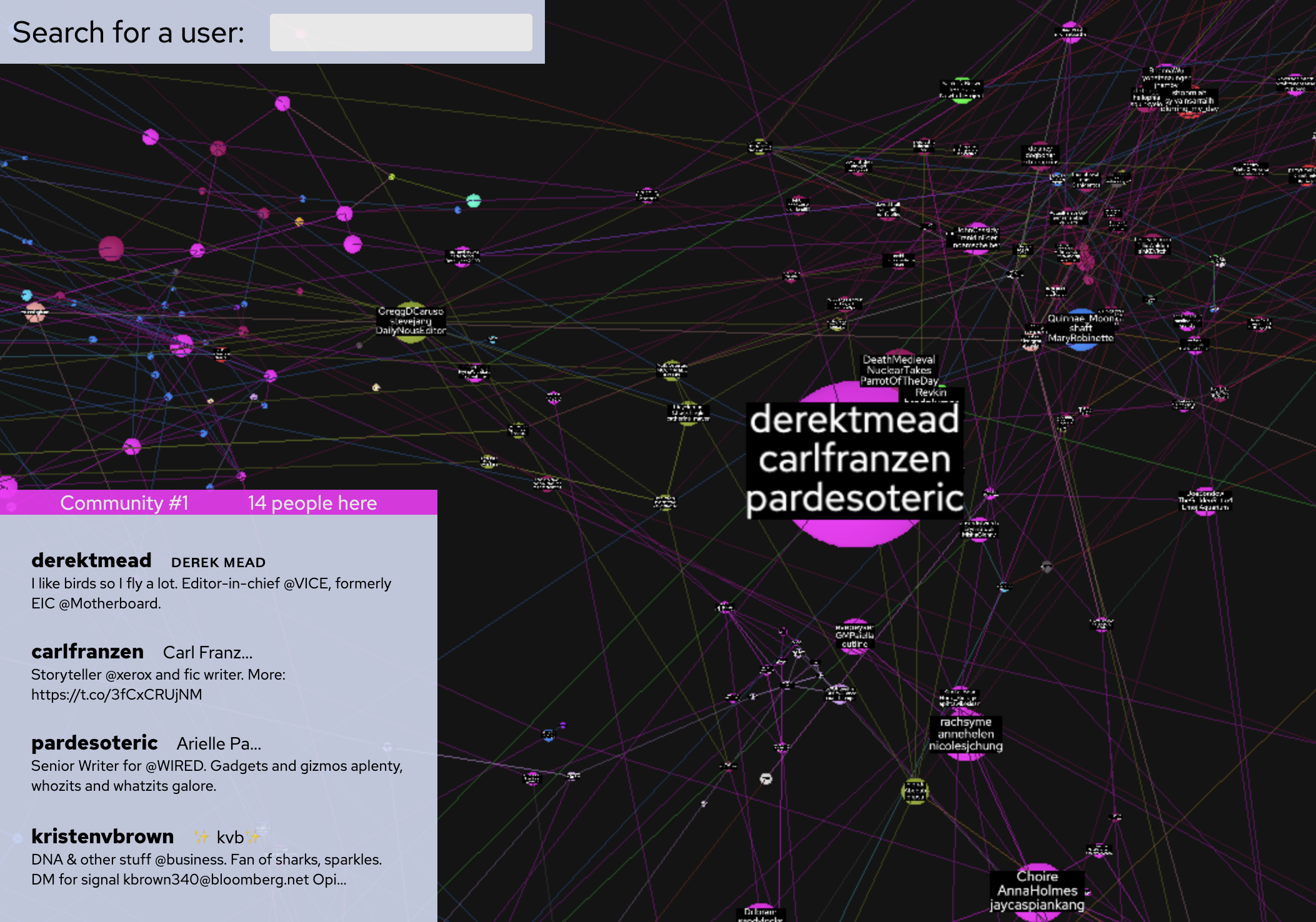
Back in the first edition of source/target I featured work from @MenanderSoter that analyzed followers and cliques on Twitter using a graph rather than the lists that Twitter provides. This has since been taken a (giant!) step further to become a searchable, interactive application built around some Twitter community groups of interest. The FAQ is worth a read for some additional context around the community detection and layout algorithms used. The visualization implementation uses three.js and it’s quick to render if a little fuzzy around the edges.
One good (relevant) example is Barabási and other network scientists in this particular community. Also take a look here for a brief but insightful exploration of a particular network subset from Anne-Laure Le Cunff (Ness Labs). Le Cunff highlights a great visual summary technique: Twitter users with a large intersection of neighbors are shown as a single node which removes a lot of cluttering links from the view.
There’s been lots of early, positive feedback for the comprehensive introduction to Knowledge Graphs made by many prominent academics in the field. To say it’s comprehensive is probably an understatement; there are 18 co-authors and 547 references (27 pages full). Full disclosure: I haven’t read all 130 pages, but I intend to try!
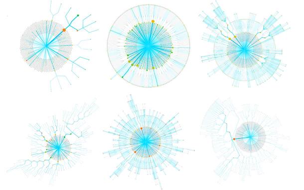
Swinging over to commercial use-cases, this application preview from Data Visualizer Du Hoang (Xaxis) caught my eye on LinkedIn. It’s called Copilot and it looks to be an interesting blend of traditional dendrograms and node-link diagrams. Take a look here for a brief write-up and summary of the intent to prioritize form over function in this application.
Links
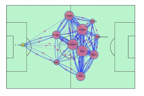
- I’m not an avid football/soccer fan but here are two graphy angles to the beautiful game: first a summary graph of passes between players; then a plot of player transfers between teams in Europe. I love the snapshot view of sports as shown in the former; you can find more examples of this in the excellent Nightingale article from last year. As for the player transfer graph there’s more context in this Spanish-language interview.
- This one has been out for a while but new to me. Made up of public data from GoodReads, the subset of User-Book interactions from the UCSD BookGraph is perhaps the largest dataset of human interactions available online. Hat tip to this release of another very large graph dataset for raising the awareness of both.
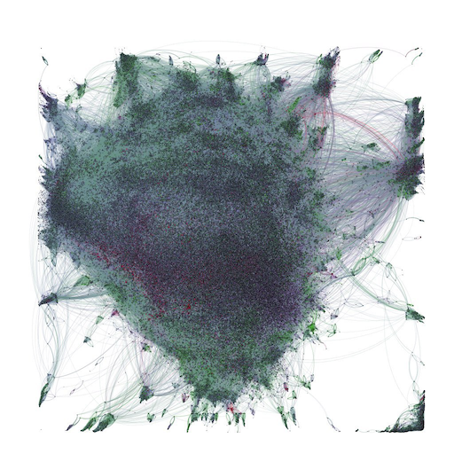
- Here’s an excellent summary of some approaches to working with Large Graphs. The graph above is a movie recommendation graph rendered in Gephi. I’m looking forward to digging into some of these tools later this year.
- Denise Gosnell (DataStax) has started her own newsletter and promises to cover graph topics. Her first edition can be found on LinkedIn and the second will drop any day!
That’s it for now. Let me know if you have any thoughts or suggestions. Otherwise I’ll see you again in two weeks.